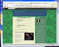
Much thanks to Grey Biker for his feedback on getting the code to work correctly!
 Now I invite your feedback -- do you prefer the current background which looks like dark purple crushed velvet?
Or the screen capture of this green background?
Let me know please in the Comments section below -- Thanks!!
4 comments:
I think the green/green combo is easier on the eyes than the purple/green. Or try the pruple/blue. I know you didn't ask for opinions on this but I would move the google ads so they don't block your title. Those flickering ones are very distracting.
Peace.............
Purple is a favorite color I use alot. Looks good.
I do like the rain forest as way to play on your name.
I usually don't like purple, but in this case it really works. There's a richness to the color that just isn't delivered by the green.
Blue
Post a Comment